Brand at a Glance
OCHRE is a creative studio focused on architecture, interiors, and editorial design. This document defines how the brand is represented across all touchpoints.
- Precise, considered, intentional
- Material-led: we favour texture, craft, and physicality
- Editorially restrained: space is a design decision
- Built for longevity, not trends
- Playful, casual, or deliberately approachable
- Minimal for its own sake
- Trend-led or reactive
- Loud or attention-seeking
Logo System
Two marks: the Wordmark (primary) and the Monogram (secondary). Never modify, recreate, or combine them.
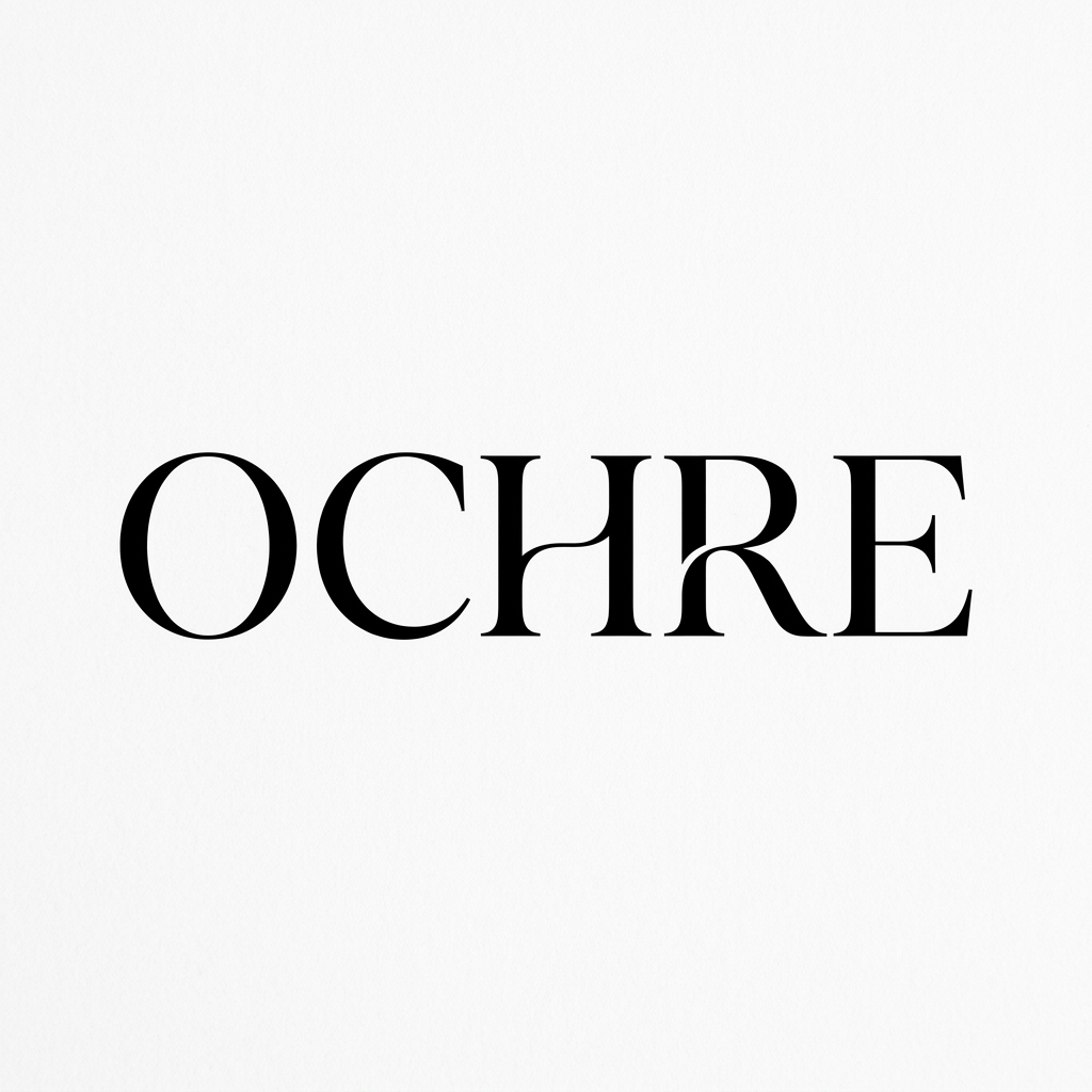 Wordmark / Light
Wordmark / Dark
Wordmark / Light
Wordmark / Dark
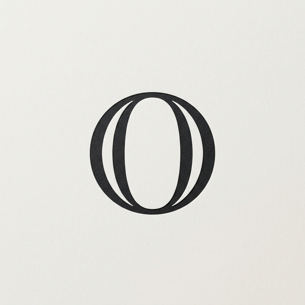 Monogram / Light
Monogram / Dark
Monogram / Light
Monogram / Dark
Minimum Size
Do not reproduce below these dimensions.
Print: 35mm
Digital: 120px
Print: 8mm
Digital: 24px
Usage Hierarchy
- Primary: Full Wordmark. Use for all standard applications.
- Secondary: Monogram. Use for favicons, app icons, social avatars, or when the full name appears elsewhere.
- Never place both marks side-by-side as a lockup.
Usage by Context
| Variant | Use | Avoid |
|---|---|---|
| Wordmark | Website, proposals, stationery, signage | Below 120px / 32pt |
| Monogram | App icons, favicons, social profiles, embossing | Alongside the wordmark at equal scale |
| Reversed | Dark backgrounds, video end cards | On ochre (#C05C10) backgrounds |
Clearspace
Maintain clearspace of 0.5× the logo height on all sides.
Misuse
Do not reduce opacity
Do not stretch or distort
Do not recolour
Do not rotate
Do not place on gradients
Do not combine both marks
Colour Palette
Four colours. Charcoal and Paper are the base. Ochre is the accent. Use it sparingly.
Usage
| Colour | Primary Use | Never |
|---|---|---|
| Charcoal | Text, headlines, dark sections | Full-page background outside hero/footer |
| Ochre | Accent, CTAs, hover states, dividers | Body text on white (fails WCAG AA) |
| Bone | Alternate section backgrounds, cards | As text colour |
| Paper | Primary page background | Over Bone without a visible border |
Typefaces
Playfair Display for headlines and display text. Outfit for everything else.
Type Scale
Photography
Natural light, raw materials, generous negative space. Warm tones, desaturated palette.
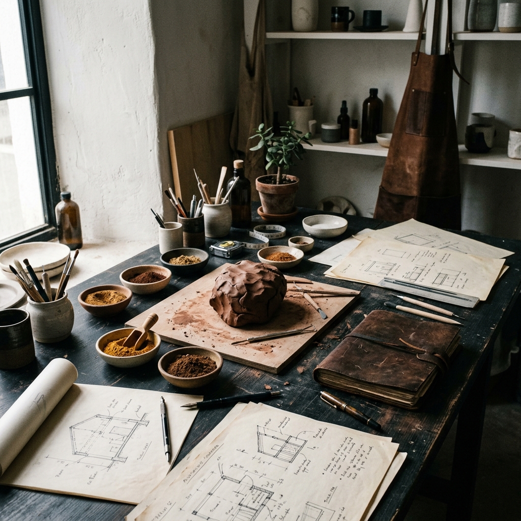
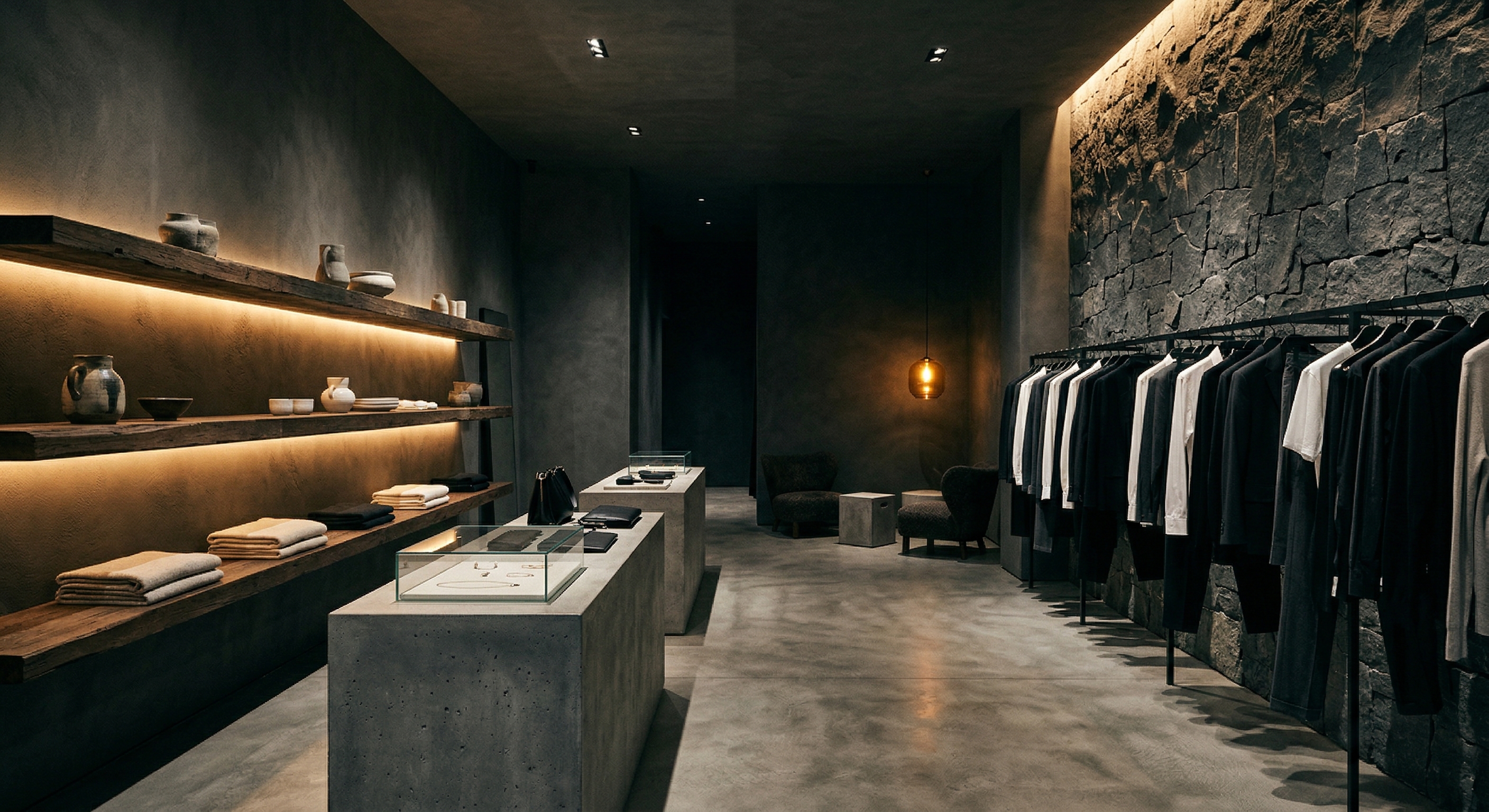
- Natural, directional light
- Raw textures: stone, paper, concrete, leather
- Generous negative space
- Desaturated, warm colour grading
- Process and craft-in-progress shots
- Oversaturated or heavy filters
- Stock photography
- Busy, cluttered compositions
- Low-resolution images (< 2000px)
- Flash or artificial lighting
Language
Short sentences. Direct statements. No jargon, no hedging.
Word Choice
| Use | Avoid |
|---|---|
| Studio. Mark. Material. | Product. Deliverable. Output. |
| We build. We make. We define. | We leverage. We utilize. We synergize. |
| Short sentences. Statements. | Long qualifiers. Hedging. Over-explanation. |
Spacing Scale
8px base unit. All spacing values are multiples of 8.
Grid
12-column grid for digital. Minimum 64px gutters between content blocks.
Assets & Enquiries
For logo files, typeface licensing, or brand application requests. All use of the OCHRE marks requires approval.
hello@aphyx.liveThis document is confidential. Reproduction without written consent is prohibited.