Premium website animations: what actually makes a site feel expensive.
Most business websites in Singapore look fine. Clean template, decent photos, the right colours. But "fine" doesn't sell. The sites that make a visitor stop, lean in, and trust the brand before they read a single line of copy feel different from the moment they load. The difference isn't usually the design. It's the motion.
We get asked a lot about this — "can our site feel more like that one?", usually pointing at something an Apple product page, a fashion brand's lookbook, or a fintech landing page is doing. The trick is, "that feeling" almost always comes from a small handful of motion techniques layered on top of an already-clean design. They're not mysterious. They're just deliberate.
Here are eight of them — what they are, why they work, and what they cost in practice. Every demo on this page is live. Scroll through, click the replay buttons, and feel them.
// Trick 01Scroll-controlled frame animation
This is the technique that makes Apple's AirPods Pro page feel like a small film. As you scroll, an object on the page rotates, transforms, or animates — but the animation isn't playing on a timer. It's tied directly to your scroll position. You scroll halfway, the animation is halfway through. You scroll back, it plays backwards. You stop, it stops.
Mechanically, it works like this: the designer renders the object (a phone, a bottle, a keycap) as a sequence of 60–240 images from a 3D model. The site loads them upfront, then a small script paints whichever frame matches the current scroll position onto a <canvas>. The user feels like they're physically rotating a real object with their scroll wheel.
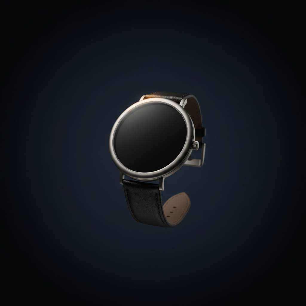
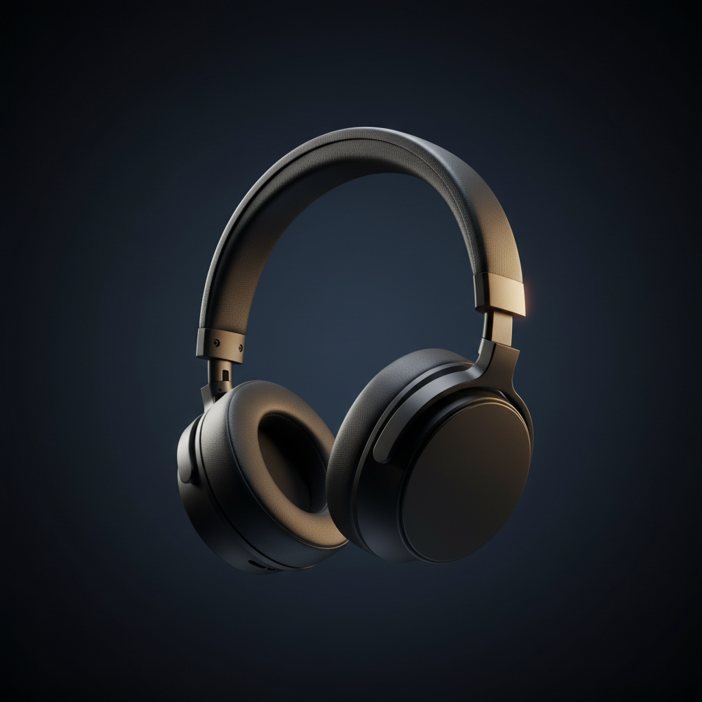
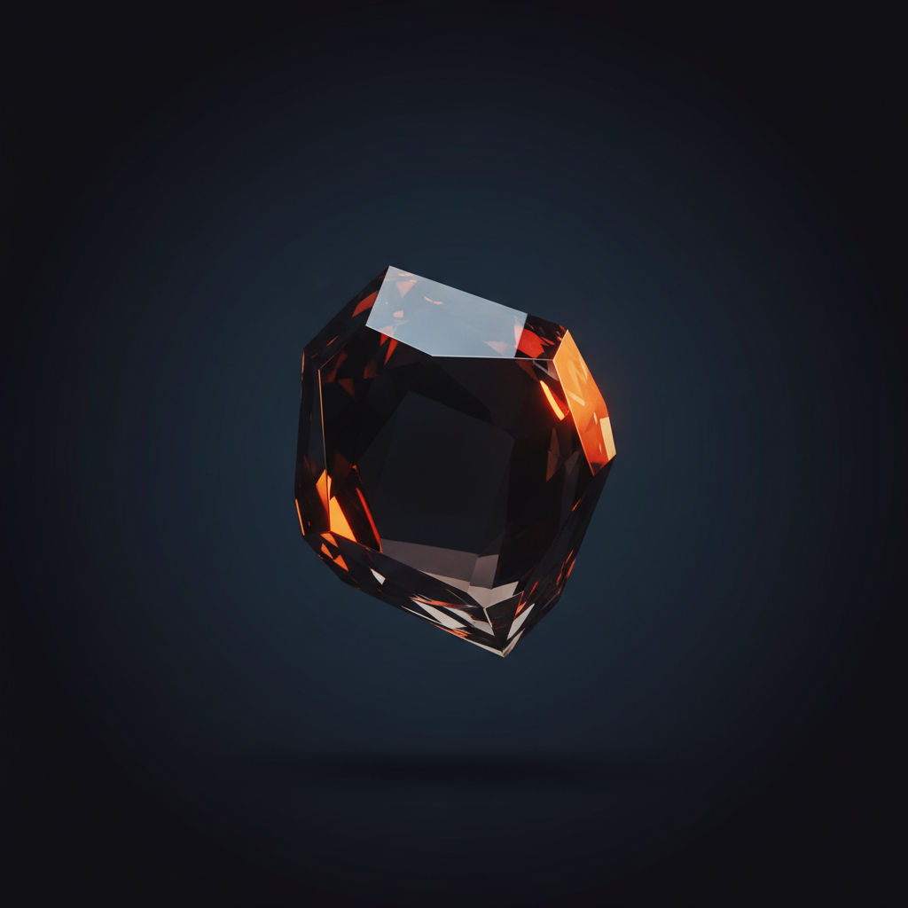
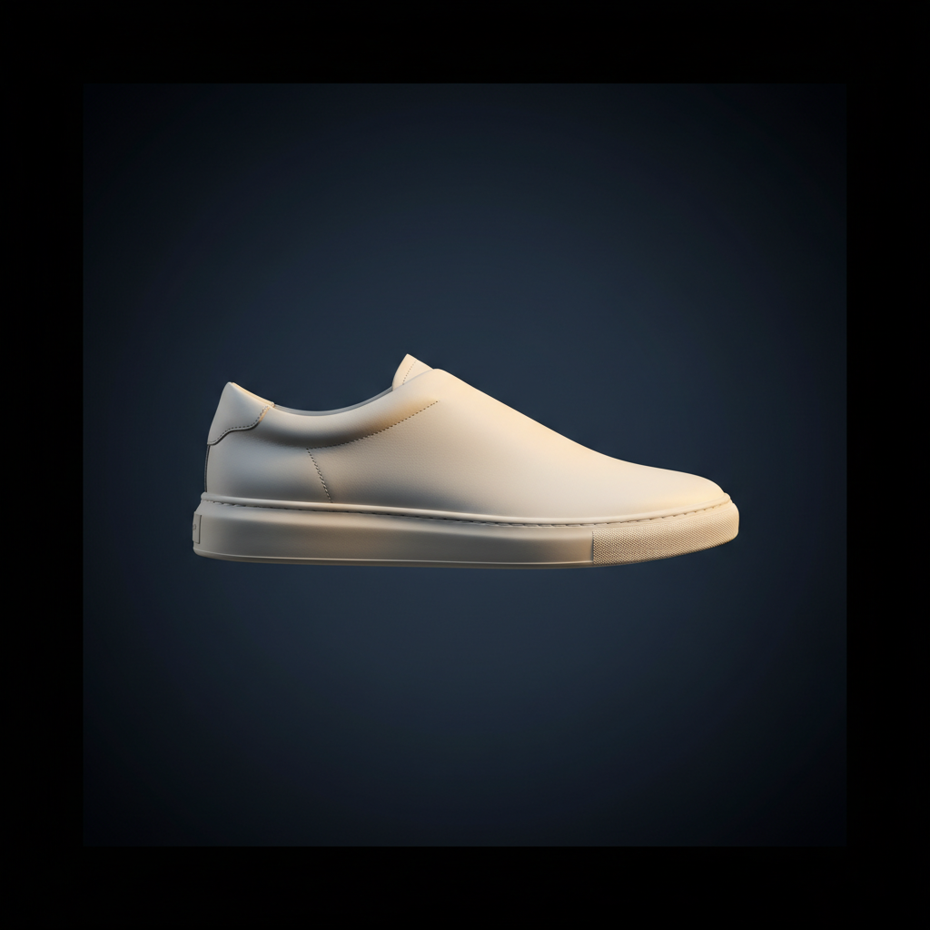
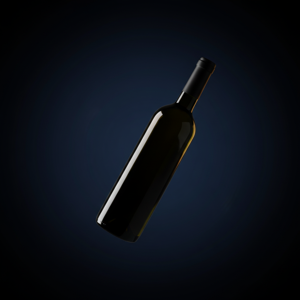
Below is a working example built with six real product images. As you scroll past the frame, the picture inside cross-fades — perfume bottle, watch, headphones, sculpture, sneaker, wine bottle — each shot in the same editorial style. The mechanic is identical to Apple's AirPods page (paint a different frame at every scroll position); the only difference is what's in each frame. A production product-rotation build uses 60–240 frames of the same object instead of six images of different ones.

Why it works: it converts passive scrolling — the most boring interaction on the web — into a tactile thing. The visitor feels like they're handling the product. That two-second moment of "wait, am I doing this?" is what makes the site memorable.
What it costs: a 3D render pass or a product photoshoot turntable (~$400–$1,500 depending on object), 1–2 days of build, and ~3–8 MB of preloaded images. Worth it for hero products. Overkill for a service business.
// Trick 02Inertial smooth scroll
Default browser scrolling is twitchy. You spin the wheel, the page jumps. Premium sites replace that with inertial scroll — a system where the page accelerates, glides, and decelerates as if it has weight. Libraries like Lenis and Locomotive Scroll wrap the native scroll behaviour with smooth interpolation.
Try it. Scroll your mouse wheel inside both boxes below. The left one is your browser's native scroll — every wheel-tick is an immediate jump. The right one is the same content with inertial smoothing — every wheel-tick coasts and settles.
The difference is hard to articulate but instantly recognisable: the inertial side feels heavier and more expensive. You stop noticing the mouse wheel and start noticing the content. It's one of the cheapest "feel" upgrades you can ship — a ~20 KB library and ten lines of setup — and it's the bedrock most of the other techniques on this list build on.
// Trick 03Text that reveals itself
Watch how the headlines on premium sites enter the viewport. They don't fade in as a block. Each line slides up from below a mask, one after the other, like a slot machine reel coming to a stop. The technique is called line-split reveal — the headline is broken into individual lines, each line wrapped in an overflow:hidden box, and each line's text is translated up from below with a small stagger between lines.
Words that arrive one line at a time are words you remember.
Hit Replay to see it again. The stagger is what sells the effect — if all three lines arrived simultaneously, it would just look like a fade. The small delay between lines makes it feel composed, like the headline is being typeset in front of you.
// Trick 04Magnetic interactions
On a normal button, the cursor hits the edge and stops. On a magnetic button, the button reaches toward the cursor as you approach it — and once you're hovering, the button gently follows your cursor's position within its own bounds. It's the same physics-trick puppeteers use: tiny motion that implies the object is aware of you.
Move your cursor around inside the box below. The button, the arrow icon, and the italic tagline are all independently magnetic — each one leans toward you when you get close.
This works best on a small number of high-intent elements — your primary CTA, a "View case study" button, an arrow icon. Apply it to everything and the page feels twitchy and cheap. Apply it to one or two anchors and the page feels alive.
// Trick 05Image reveals with clip-path
Instead of fading or sliding an image into view, premium sites wipe it in — a mask sweeps across and the image is gradually revealed underneath. The CSS property doing the work is clip-path, animated between two states (e.g. inset(0 100% 0 0) → inset(0 0% 0 0)). A subtle bright "edge line" can ride along with the sweep to sell the effect.
Same trick, much more theatrical than a fade. Works especially well on testimonial portraits, hero images, and big numbers (stat reveals). The bright edge sweeping along with the mask is what separates a premium reveal from "the image just appeared."
// Trick 06The infinite marquee
A horizontal strip of text or logos that scrolls forever, edges fading into transparency on both sides. Premium sites stack two marquees moving in opposite directions — one with a brand tagline, one with client logos — for a "moving banner wall" effect that signals momentum without forcing the visitor to do anything.
Pure CSS, no JavaScript needed — two copies of the content sit side-by-side and the track animates 50% to the left forever. Mask the edges with a CSS gradient so items appear to fade in and out instead of hard-cutting at the viewport edge. Cheapest "designer" move on this list.
// Trick 07Parallax (the modern, restrained kind)
The 2014 version of parallax was a gimmick — distant mountains shifting too slowly while the foreground raced. The 2026 version is subtle: distant elements move 10–15% slower than nearer elements, creating a faint sense of depth without screaming "look, parallax!" at the visitor.
Scroll through the scene below. Five layers — sun, distant mountains, middle ridge, near hills, and the foreground silhouette — each moves at a different rate. Watch the foreground figure overtake the mountains as you scroll, then watch the relative speeds reverse when you scroll back up.
The rule: if a visitor would notice the parallax, you've overdone it. The good version is felt, not seen. The version above is exaggerated for teaching — in a real client build the layer offsets would be roughly half what we've used here.
// Trick 08Ambient colour & light
Premium sites are rarely white-on-white. There's almost always a faint, slow-shifting gradient sitting behind the content — a soft purple drifting to a soft teal, or a warm peach breathing through the background as you scroll. CSS gradients or blurred coloured orbs animated over 20–40 seconds, colours pulled from the brand palette at low opacity (5–15%).
This is the visual equivalent of background music in a luxury store: you don't think about it, but the absence of it is what would make the room feel cheap. Watch the orbs above for a few seconds — the composition never repeats exactly the same way.
The visitor doesn't think "wow, what nice motion design." They think "this brand has its act together." The motion is the messenger, not the message.
What this signals to a visitor
The hard part of selling a service in Singapore — accounting, legal, design, anything — is that the visitor can't see the quality of your work before they buy. They can only see your website. So the website itself has to communicate "we sweat the small stuff" before the visitor reads a single sentence.
Motion is one of the most efficient ways to do that. Three seconds of an inertial scroll plus one well-built scroll-controlled animation tells the visitor: "we pay people who care about details." That's the actual purchase the prospect is being asked to make.
The same logic is why luxury watch shops have heavy doors and brass handles. The detail signals the price tier of what's behind it.
When NOT to add premium motion
- If your traffic is dominated by mobile users on slow connections — heavy scroll-frame animations can murder your Largest Contentful Paint score. Optimise the image sequence (WebP, 1024px wide max, ~30 frames not 240) or skip the technique.
- If your audience values speed over polish — utility-driven users (B2B SaaS dashboards, booking flows, e-commerce checkout) want the page to get out of the way. Save the cinematic moves for the marketing pages.
- If you can't afford to maintain it — motion code goes stale faster than static layout. Whoever ships this needs to be available to fix it when a browser update breaks it in 18 months.
- If accessibility matters (and it should) — every animation on this list should respect
prefers-reduced-motion. About 5% of visitors have it on; if your page shakes for them anyway, it's a bug, not a feature. Every demo on this page checks for it.
What we build
The Aphyx Premium tier ships sites with these techniques baked in from day one — inertial scroll on every page, scroll-driven product animation on the hero, magnetic buttons on the primary CTAs, line-split reveal on headings, ambient gradient backgrounds, and prefers-reduced-motion handled across the board.
The Starter tier ships a clean static site with subtle reveals on scroll — fast to build, fast to load, no premium motion overhead. It's the right call for most service businesses where the site's job is to convert search visitors to enquiries, not to be a brand experience.
The page you're reading right now uses six of the eight techniques on this list. It's deliberately a midpoint — enough motion to feel intentional, not so much that it slows the page down.
See what premium motion looks like for your business
We'll show you a 90-second concept for your homepage with the right motion stack for your audience — no commitment, no PowerPoint.